An International Ecosystem for Cannabis Companies
Share
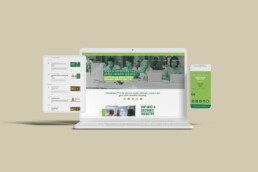
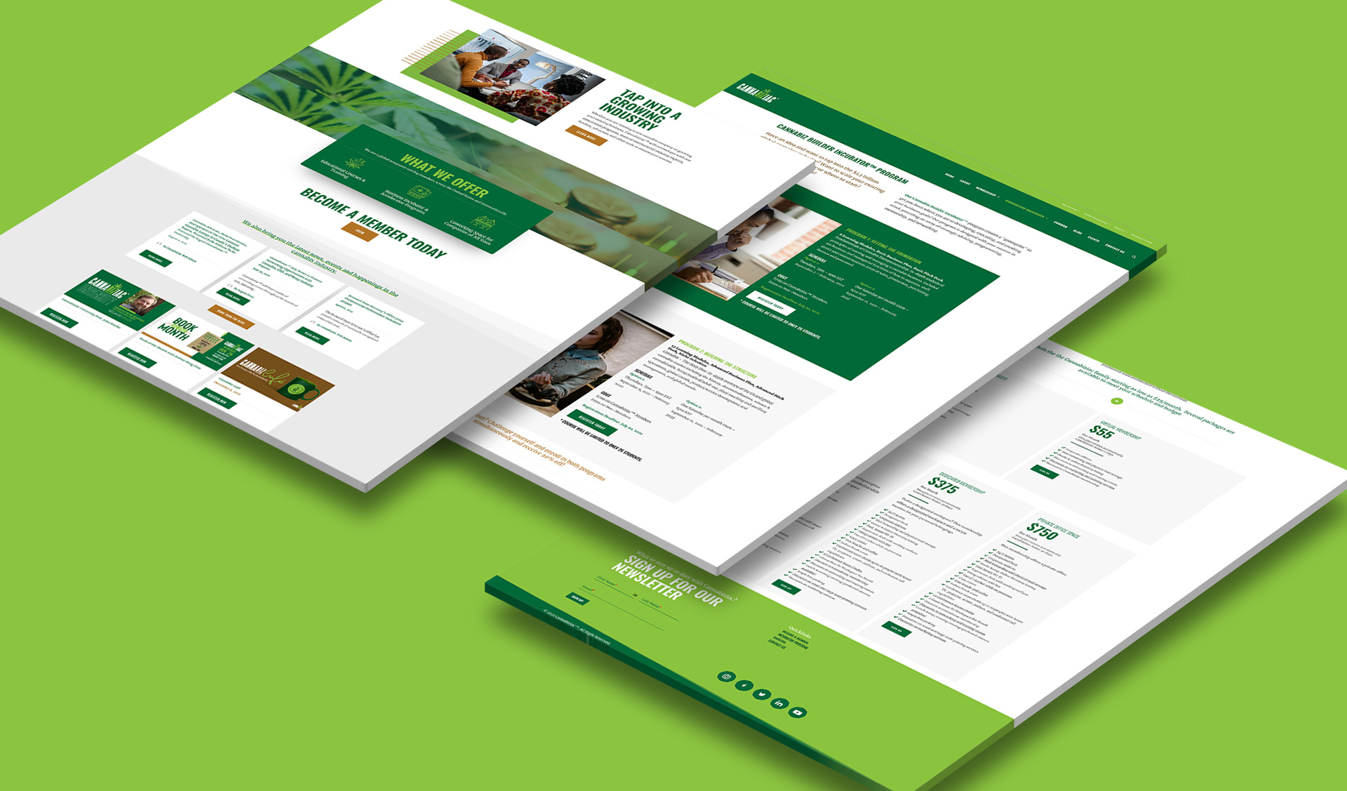
Web Design
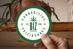
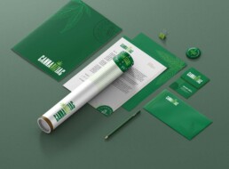
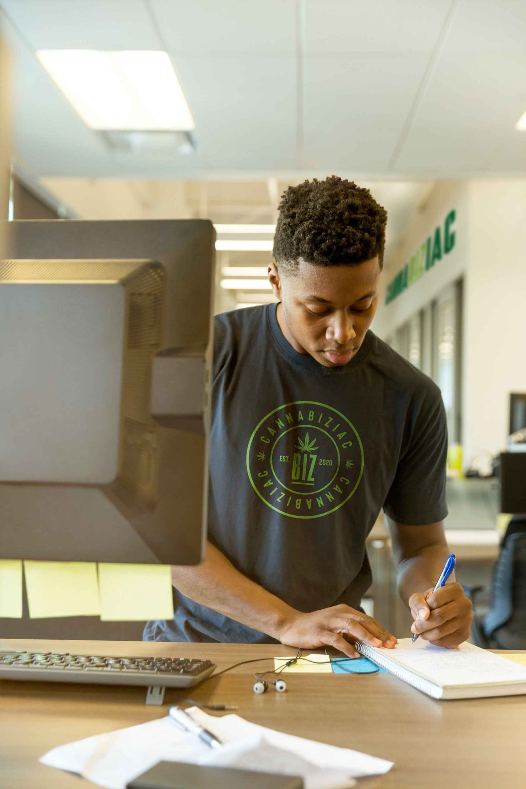
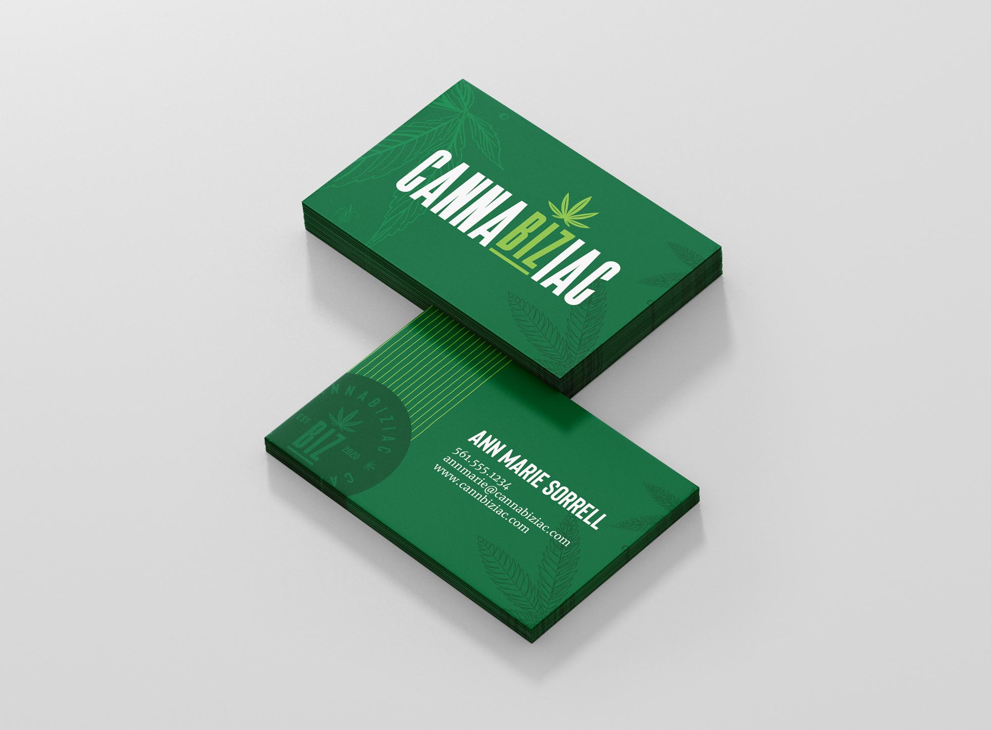
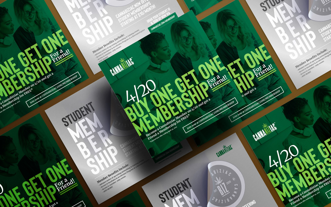
Cannabiziac®
Services
- Brand Identity
- Web design and development
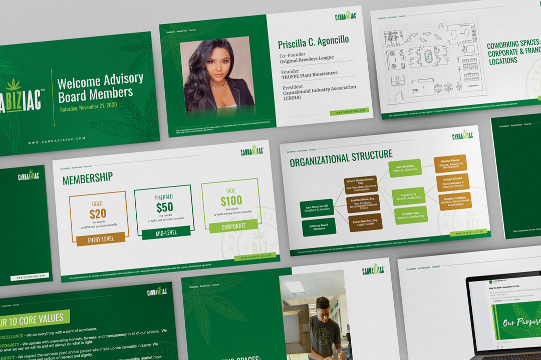
The Mission
The global cannabis industry has already eclipsed over $45 billion dollars and it isn’t even fully legal in any country. With several startups and already established companies gearing up to take a piece of the pie, in comes Cannabiziac to offer services that will help these companies in business development, education, and co-working solutions.
The Solution
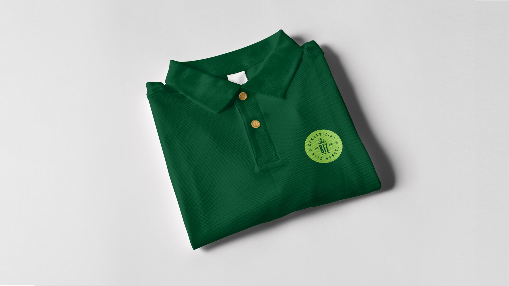
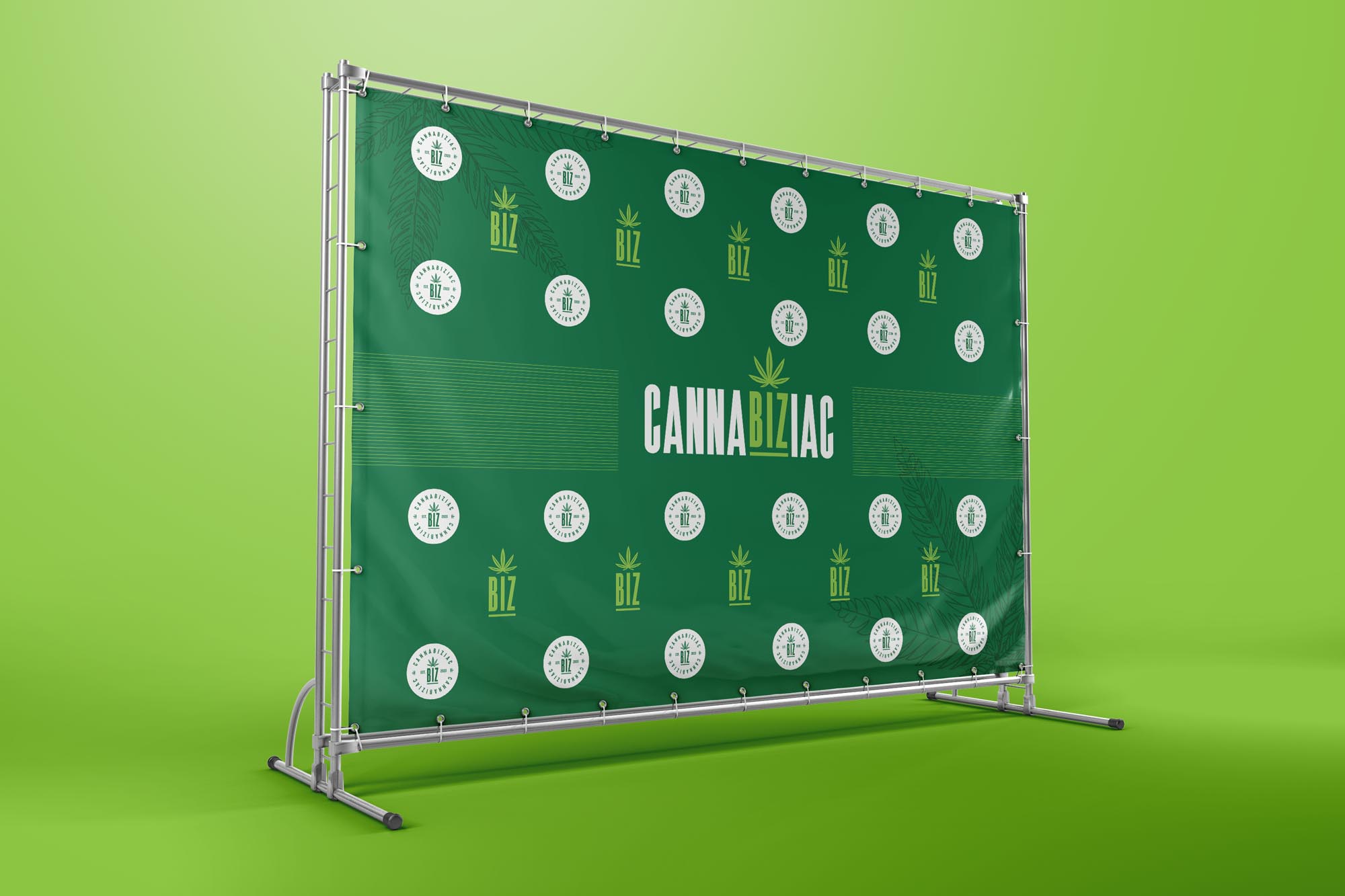
As a non-plant-touching cannabis company, Cannabiziac would need a corporate brand identity that would separate it from it’s plant-touching counterparts. A new website would be needed to bring awareness to the company and it would serve as its main touchpoint. Several collateral pieces such as presentation decks, print-ready templates, event ads, and social media images would also be added to the arsenal.
The Impact
A year and a half after its launch, Cannabiziac has experienced a lot of growth by way of collaborations and program development. It successfully launched its first incubator program in 2021 and its 2022 cohort will start soon in the Spring. It engaged with hundreds of viewers through their virtual event series, Cannabiziac University and the Book of the Month Club, where they collaborated with several cannabis experts, educators, and authors. Cannabiziac further expanded into the education space with a collaboration with Florida A&M University’s Medical Marijuana Education and Research Initiative (FAMU-MMERI). To top it all off, Cannabiziac installed its first advisory board, made up of several experts in diverse industries such as cannabis, finance, and law.


Showcasing The City Of Miami Gardens, The Host City Of Super Bowl 2020
Share
Web Design
City of Miami Gardens
Services
- Brand Identity
- Signage
- Web design and development
Collaborative Partner
The Mosaic Group
The Mission
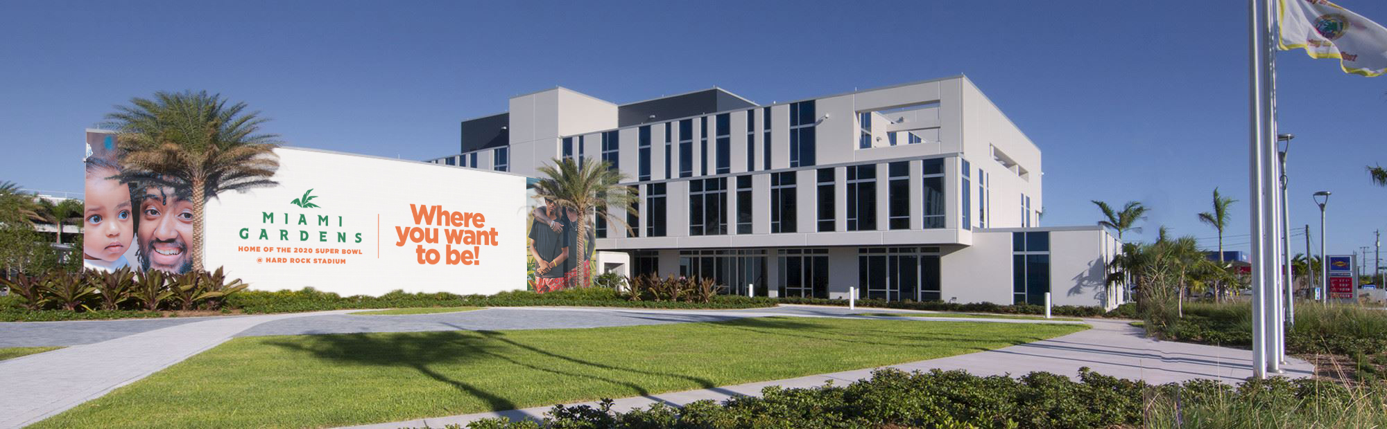
As the host of the 2020 Super Bowl, the City of Miami Gardens sought to create a branding and advertising campaign that would raise the city’s profile, bolster positive media coverage and generate new economic development leads.
The Solution
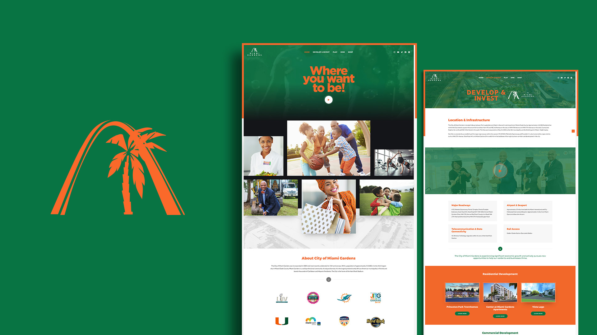
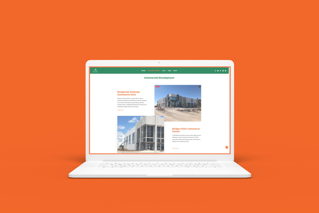
In collaboration with the Mosaic Group (our go-to marketing firm partner), we helped create a campaign brand that would include messaging with a tagline theme, social media ad graphics, signage and print collateral, and a micro-website that showcases city attractions.
The Impact
The campaign run helped to enhance the image of the city as a great destination for dining, investing, community recreation, and shopping. Since the 2020 Super Bowl, Formula 1’s Miami Grand Prix has adopted Miami Gardens and Hard Rock Stadium as a home for their event. Despite the covid-19 pandemic, there have been several major commercial real estate purchases made and businesses are opening up new locations in the city.
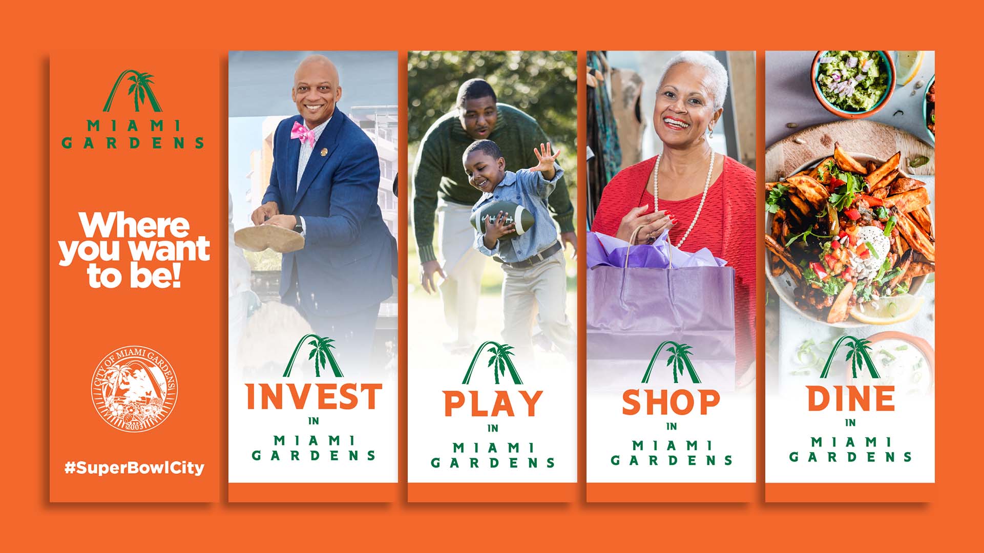
The City of Miami Gardens is the third largest municipality in Miami-Dade County and the largest majority African-American community in the state of Florida. In it, lies Hard Rock Stadium: home of the Miami Dolphins, University of Miami football team, The Miami Open, Formula 1’s Miami Grand Prix, and Jazz in the Gardens Music Fest. These major events bring in billions of dollars every year to the county, municipality, and surrounding communities. The city’s biggest foe however, is the negative media attention it sometimes gets because of the crime rate. Former Mayor Oliver Gilbert wanted to change that with a positive image campaign leveraging the upcoming Super Bowl, which the city and stadium would be hosting for the 6th time, and the 11th time for all of Miami-Dade County, an NFL record.
Our collaborative partner, the Mosaic Group, ranked first out of three finalists and was the chosen marketing company to bring this campaign to life…but let’s rewind a bit. The final part of the City’s selection process required that each finalist create a mock campaign of what this brand and process might actually look like. Ordinarily, we wouldn’t create an entire brand or iteration without actually being booked, but we knew that this was a grand opportunity to get the public’s eye on our work, especially DURING THE SUPER BOWL! So we went to work!

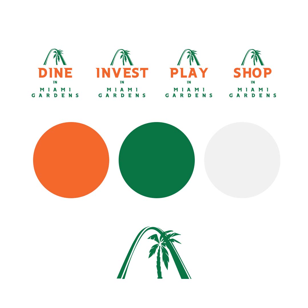
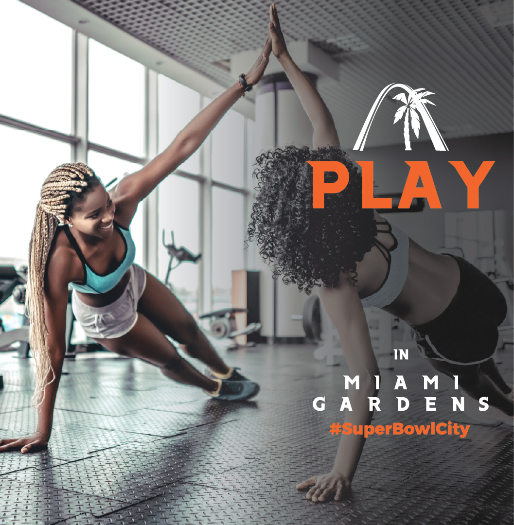
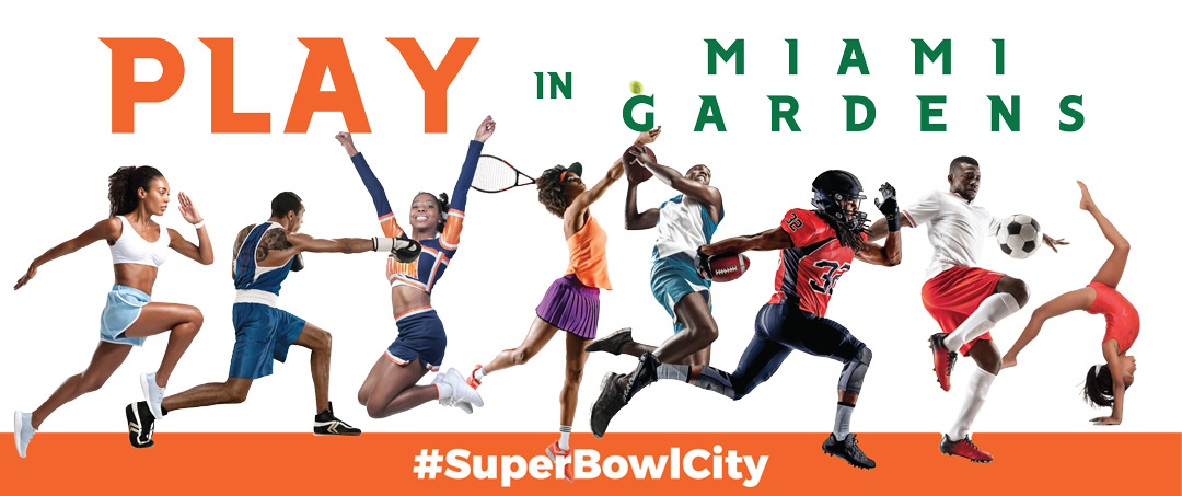
We created a strong brand iteration that would give the City a glimpse at our capabilities and see what this campaign can possibly look like. We created several mockups of large signage, billboards, and photography that would span across several locations around the city. This would be a sub-brand in a sense because it wouldn’t replace the City’s seal or official brand identity, but it would just be used during the weeks leading up to and after the Super Bowl, so we wanted to keep it simple and let the messaging, photography and signage do most of the talking. The city’s official colors, orange and green, were used throughout the campaign brand. We chose these colors because it would bring familiarity to the community. These colors are on the same palette of the University of Miami and Florida A&M University. Two schools in which many alumni reside in Miami Gardens or surrounding communities.
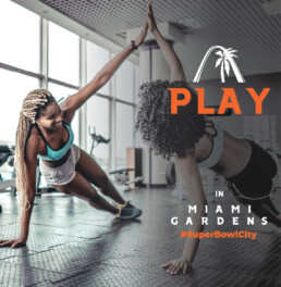
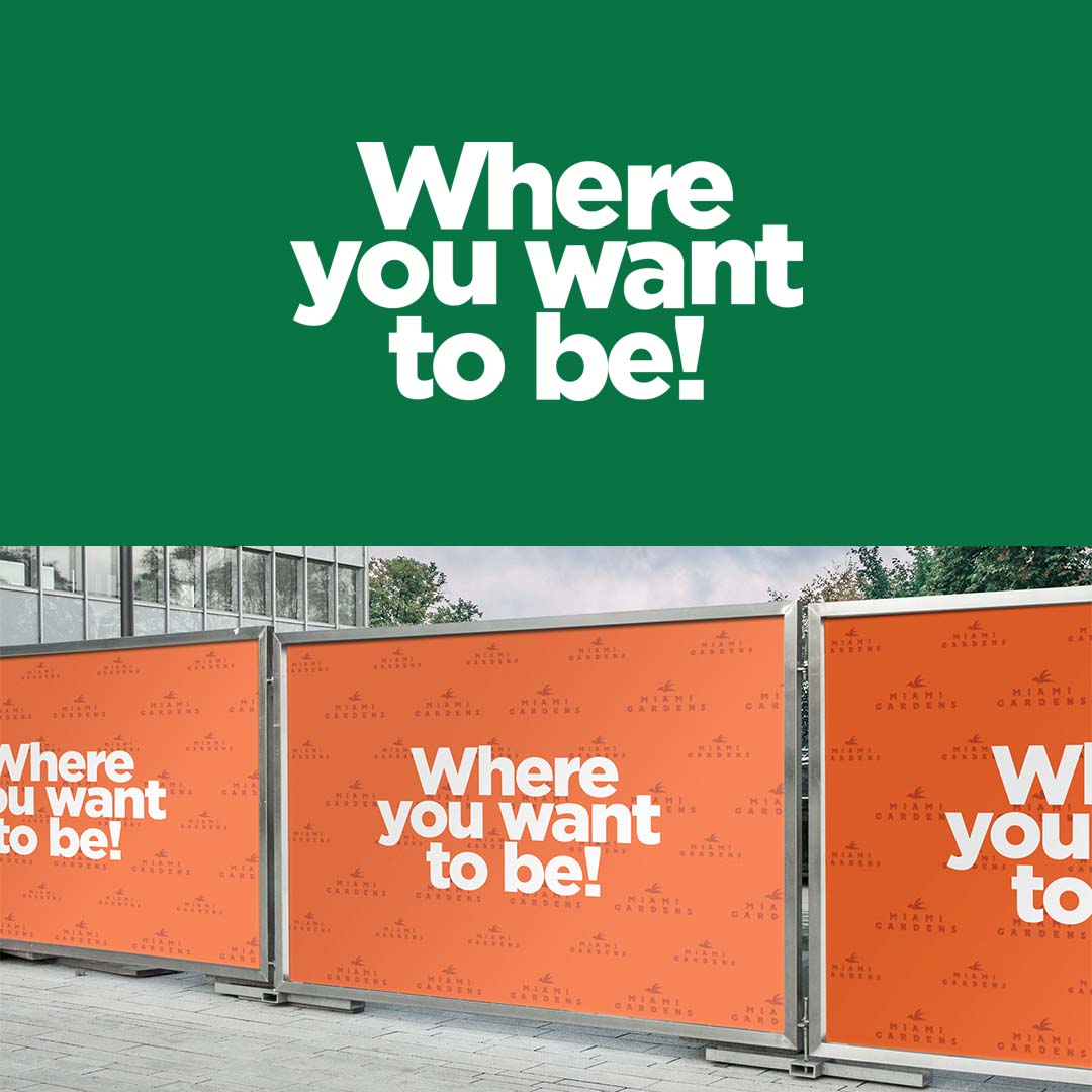
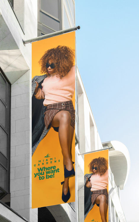
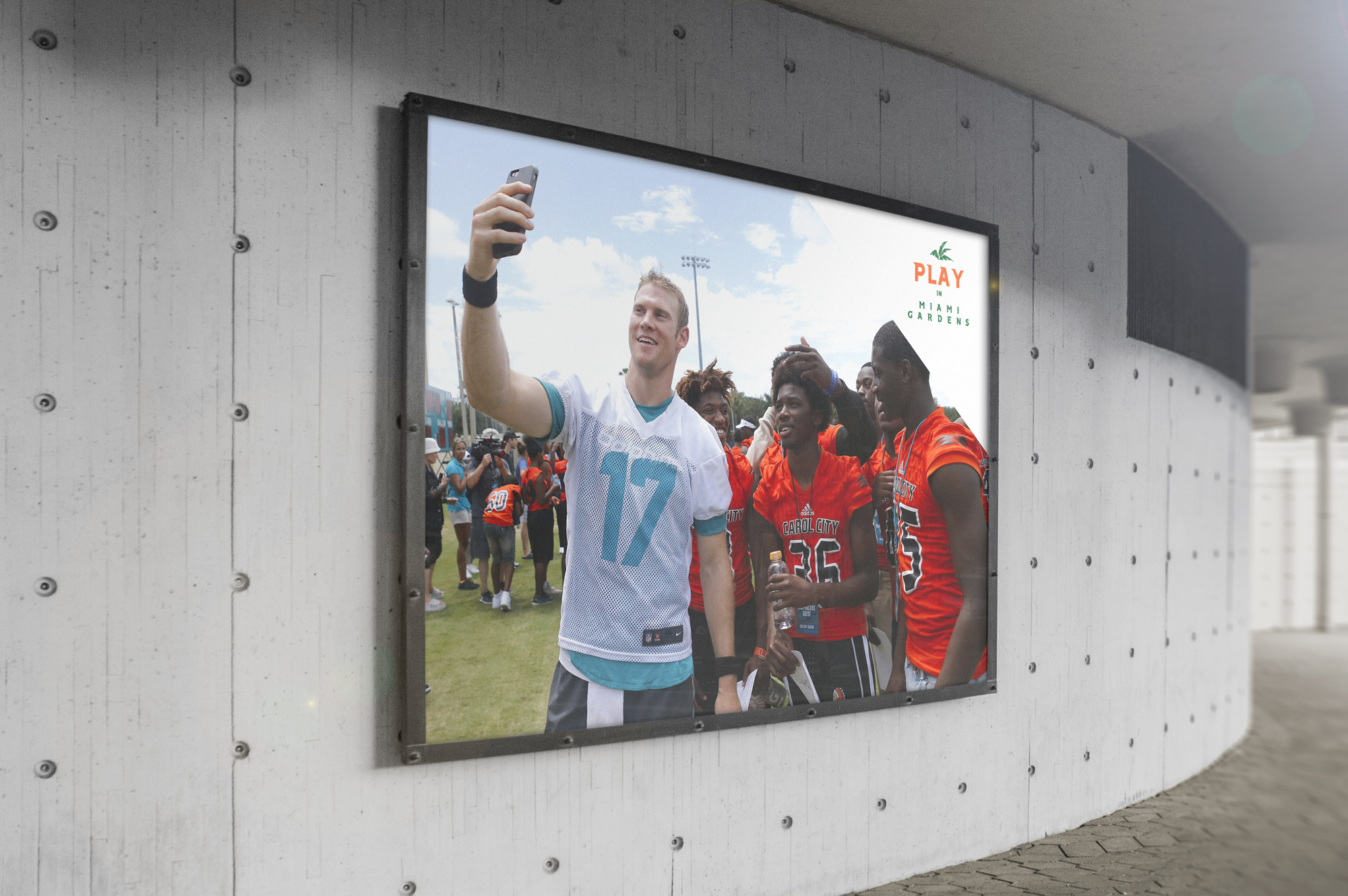
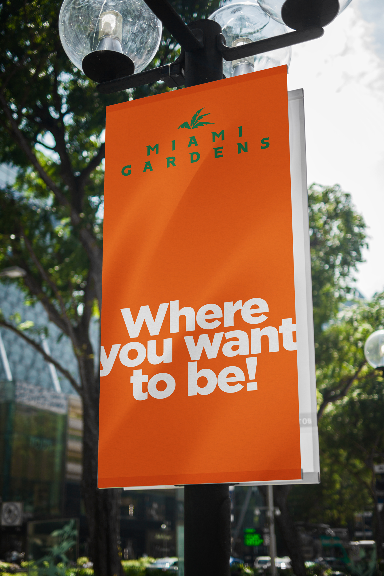
Bold typography was used for the tagline of the campaign, “Where you want to be!”. A similar bold type was also used for the majority of the marketing materials’ direct messaging of: DINE, INVEST, PLAY, & SHOP in Miami Gardens. We printed all of this material on poster boards and created additional digital mockups to present to the Mayor and his executive board during the presentation. To our surprise, not only did they love the sample campaign brand…we were selected to take on the job AND they wanted to keep what we already created!! No other iterations or concepts were needed and what we thought would just be a sample would actually blossom into the official campaign brand and imagery. Now that’s how you knock it out of the park on your first swing.
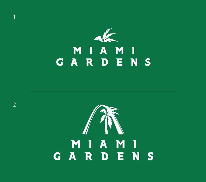
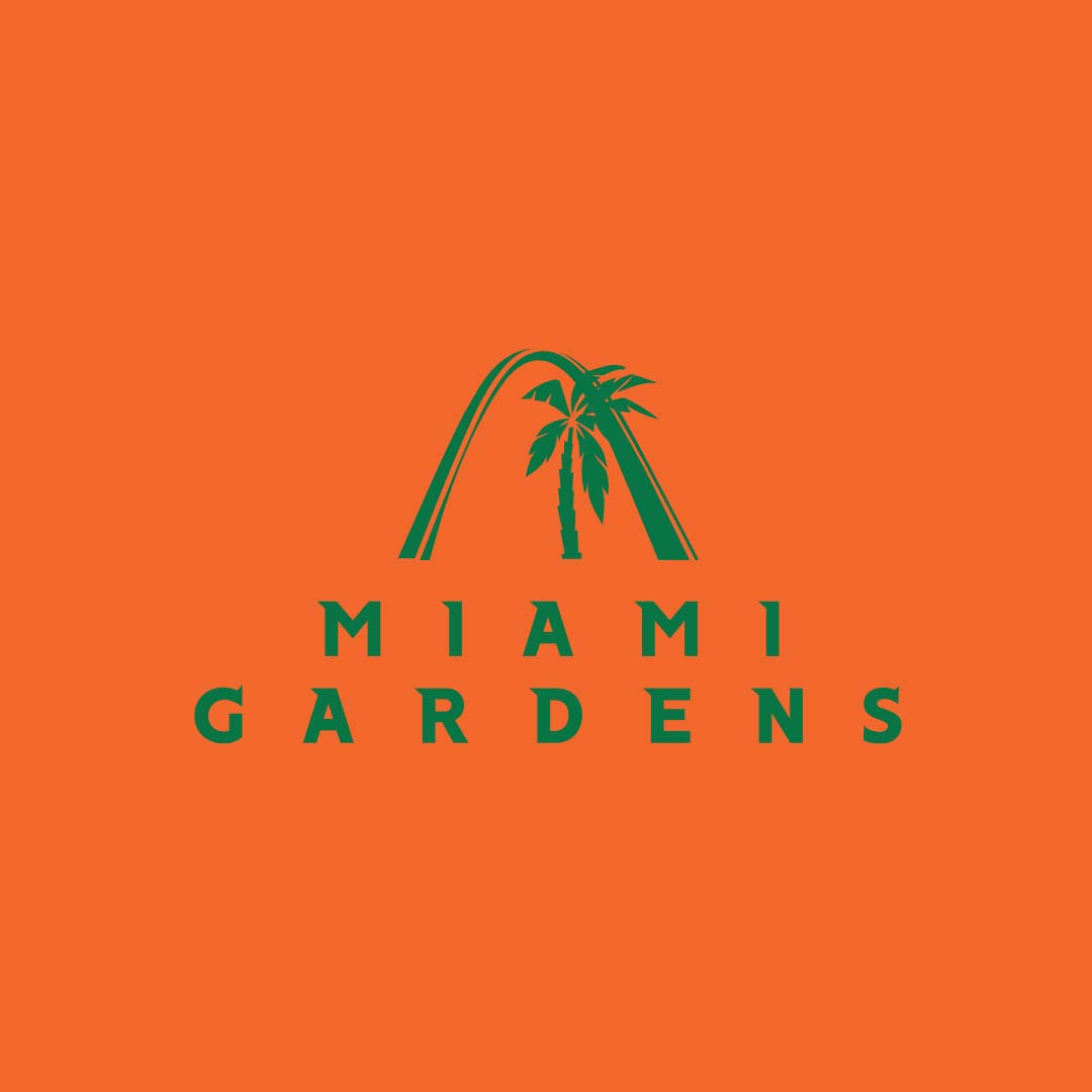
One small hurdle that needed to be made during the middle of the process, was an adjustment in the brand’s logo. Originally, there was an emblem of the top part of a palm tree, a staple icon in South Florida. However, an executive member felt that the image looked similar to a cannabis leaf. At first we disagreed. We showed it to several of our colleagues and family members just to get an outside opinion and everyone said the same thing…”it looks like a palm tree to me”. However, we thought about the original mission of this campaign and why Miami Gardens needed to execute this: an improved and positive community profile that would help increase economic development. As a predominantly African-American community with poor media coverage at times, the last thing we wanted to do is create any type of branding that would cause negative publicity in the eyes of the public. Although medical cannabis was legal in Florida during this time, it just wouldn’t be a good look if that was the main icon of the city. This would for sure defeat the mission as a whole. So we agreed that it should be adjusted and changed. We decided to still include the palm tree but this time, with the entire tree’s stump included. We also coupled it with one of Miami Garden’s popular landmarks, the Sunshine State Arch. This was a hit with everyone and the remaining marketing collateral was finalized.
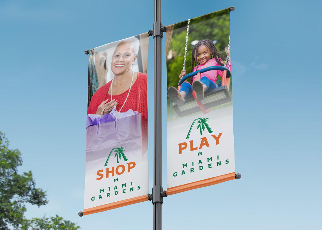
At the end of the process, twice as requested signage was created and installed across the entire city. From flag pole banners to window screens, the message and imagery was placed in many city locations such as parks, gyms, shopping centers, and city hall. The brand was so well received that many of the installations remained for over a year. What we are most proud of, is that Miami Gardens has decided to create a new campaign project in 2022 that would piggy-back and continue the messaging of this project as many new developments and investments have been made into the city. This project was a big win for the community, for Miami Gardens, and for Miami-Dade County!

Rebrand. Real Estate. Real Results.
Share
Web Design
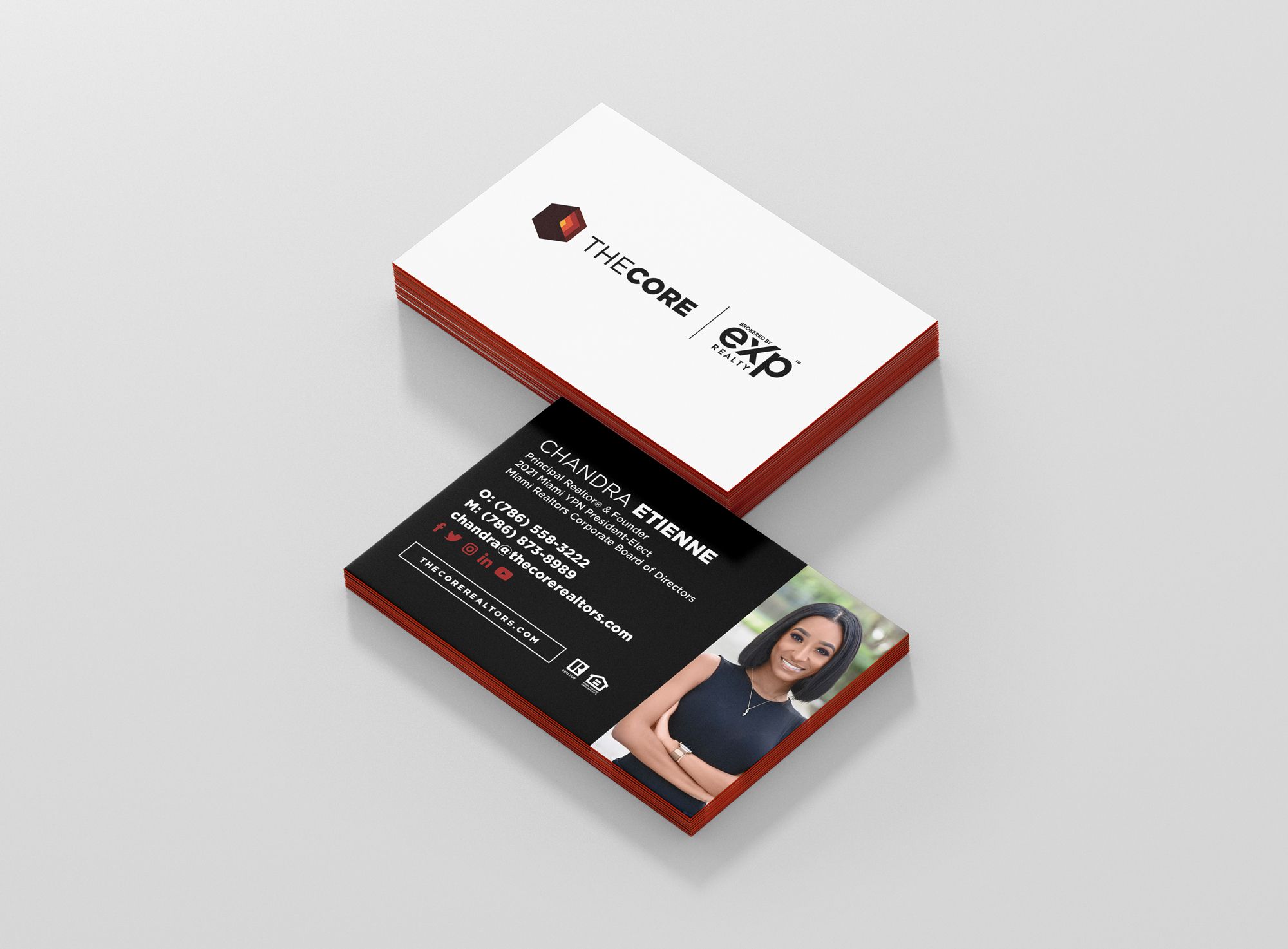
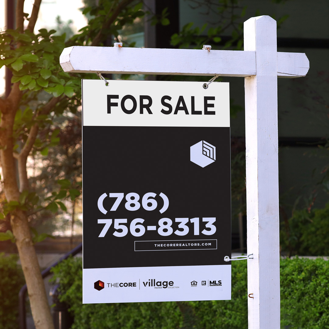
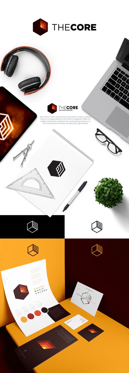
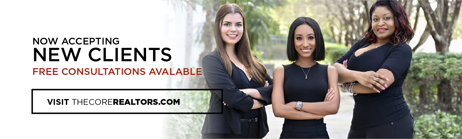
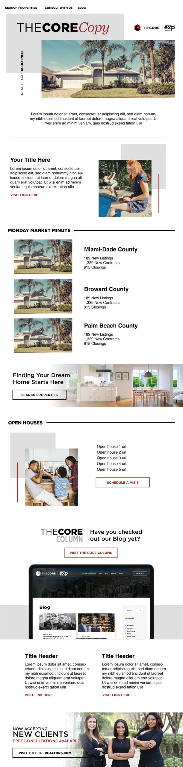
The Core Real Estate Advisors
Services
- Brand Identity
- Web design and development
Collaborative Partner
The Mission
South Florida real estate team, the Chandra Etienne Group, had reached a point in business where it was time to expand and reposition itself in the industry. The desire of the principal realtor, Chandra Etienne, was to increase agent-attraction and organically gain more qualified sellers.
The Solution
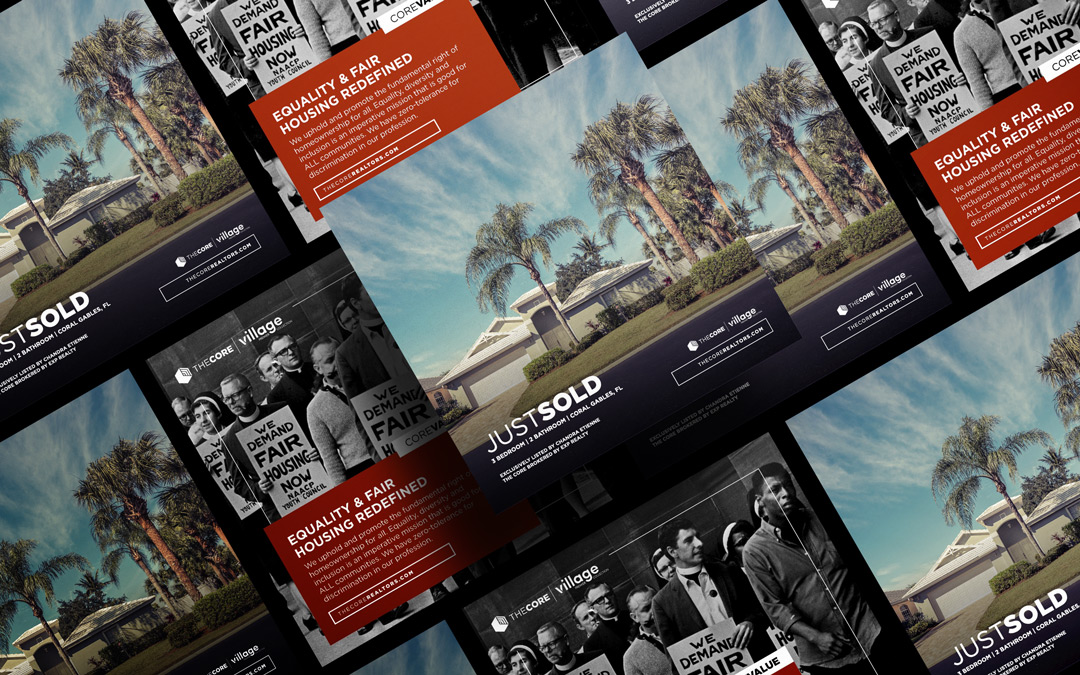
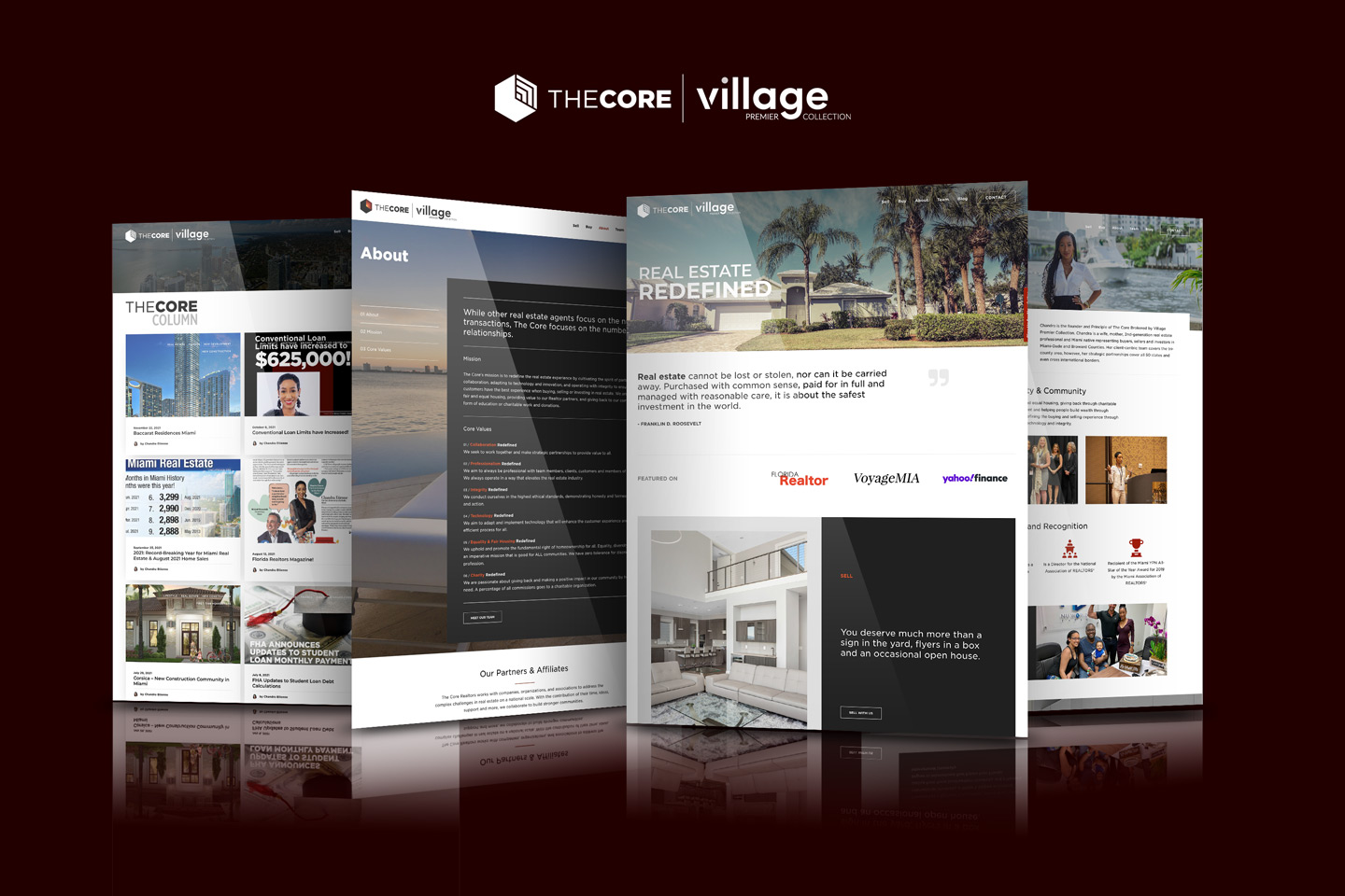
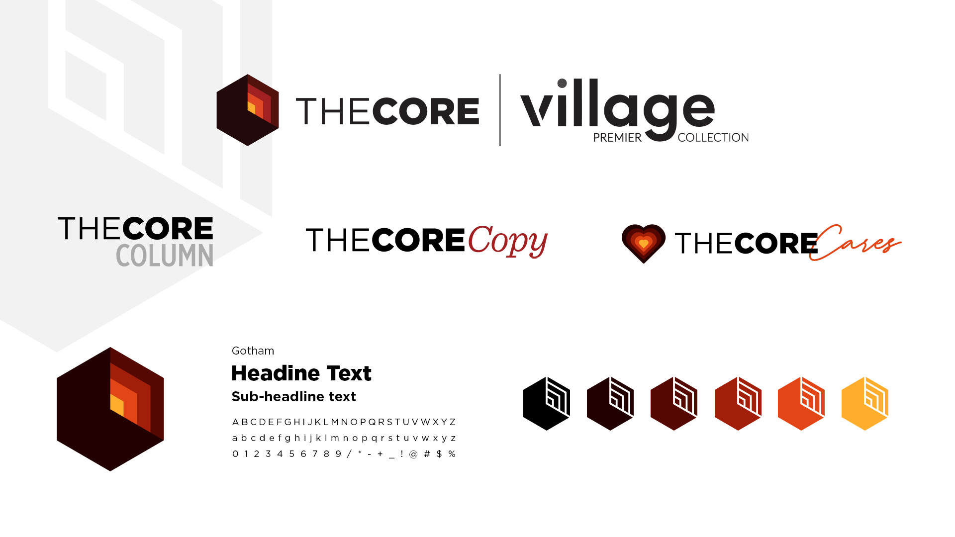
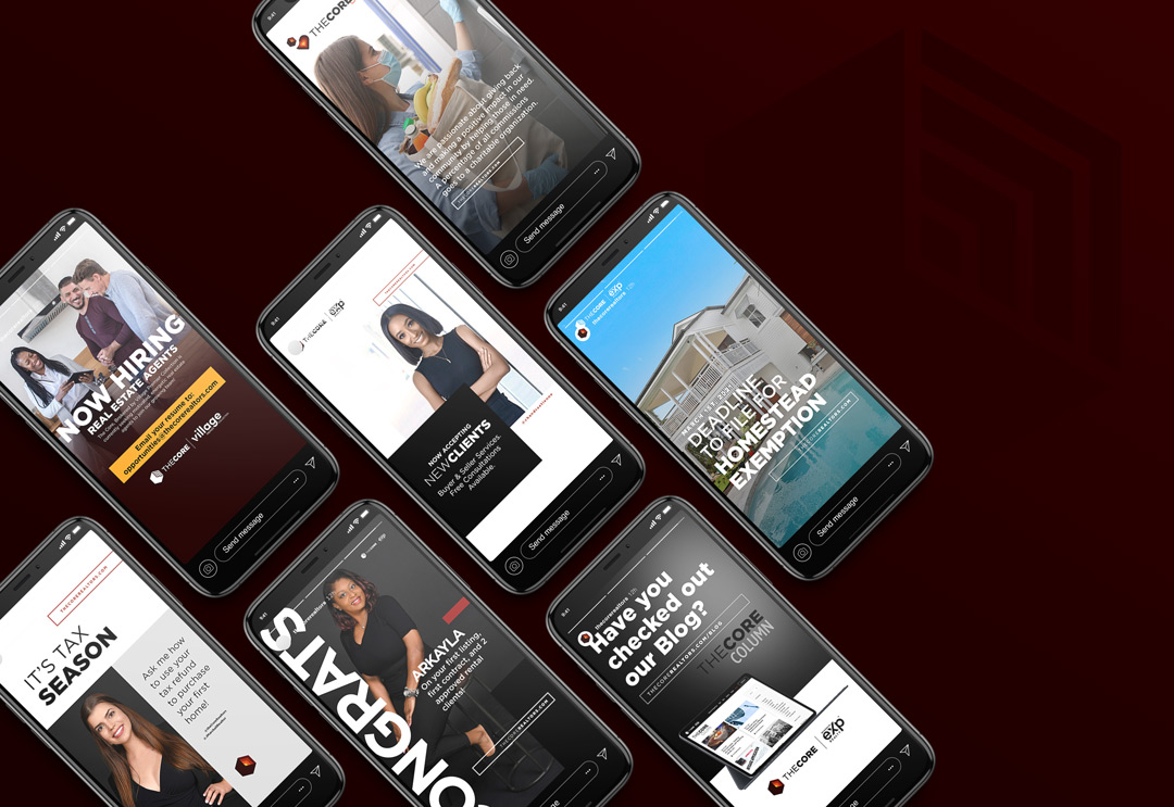
The Chandra Etienne Group is now… The Core. To accomplish the mission, a complete rebrand including a name change was successfully implemented. A website refresh and social media graphics would also follow with a focus on new messaging strategies.
The Impact
After the launch of the rebrand, The Core’s team began to scale immediately. The team grew by 60% bringing in new agents in Florida and Georgia. Their seller listing volume grew by 28% from the year prior, which helped to generate an increase in gross income by 67%. As a bonus, the average buyer price point also increased by 38%. As for individual success, Chandra would become the new president-elect for her local realtor board, YPN Network of Miami Association of Realtors. Her leadership also expanded on a state and national level, gaining new executive board positions for the National Association of Realtors. As icing on the cake, The Core is now part of The Village Premier Collection brokerage which has offices in Atlanta, D.C., Seattle, Tampa and now Miami, where Chandra will be the general manager and lead broker of the Florida division.